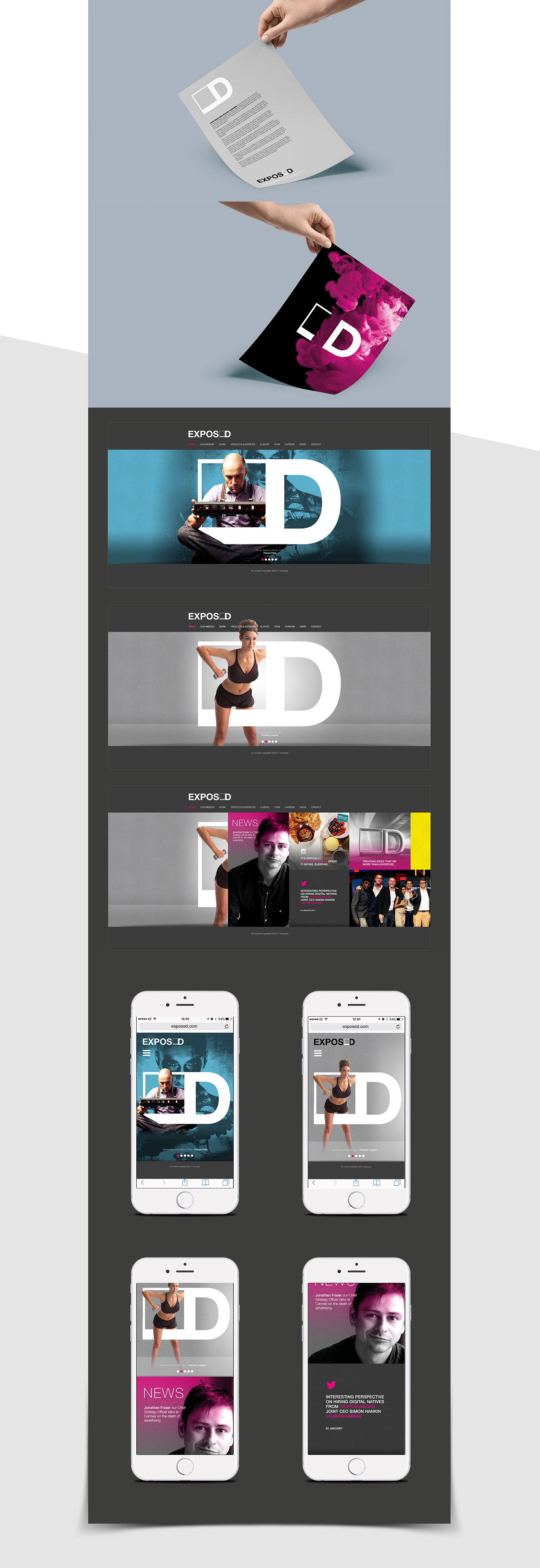
BRANDING A CREATIVE AGENCY TO HELP THEM TELL STORIES
The Brief
Exposure Digital were rebranding to 'Exposed' to help give the agency it's own identity and not just appear as a department of parent agency Exposure. As such they required a rebrand that helped them tell their own story.
The Idea
I focussed on how to make the brand feel iconic and tell the story of Exposed through their own content and client work. They still wanted to retain the recognisable poloroid mark of exposure so I fused the D onto that mark creating a simple icon that could be manipulated through film, photography and design into a physical form.

Film
I wanted to show the logo as though it was actually part of a narrative story, physically always there. This could then be used throughout client presentations, film stings etc.
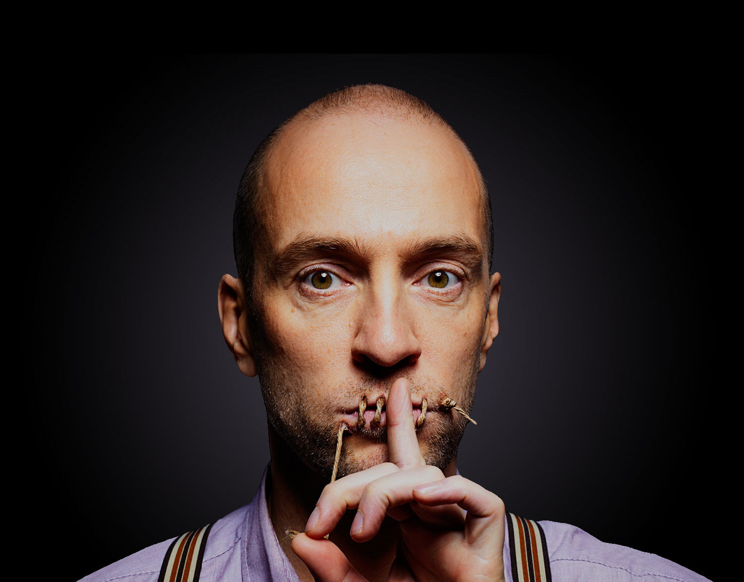
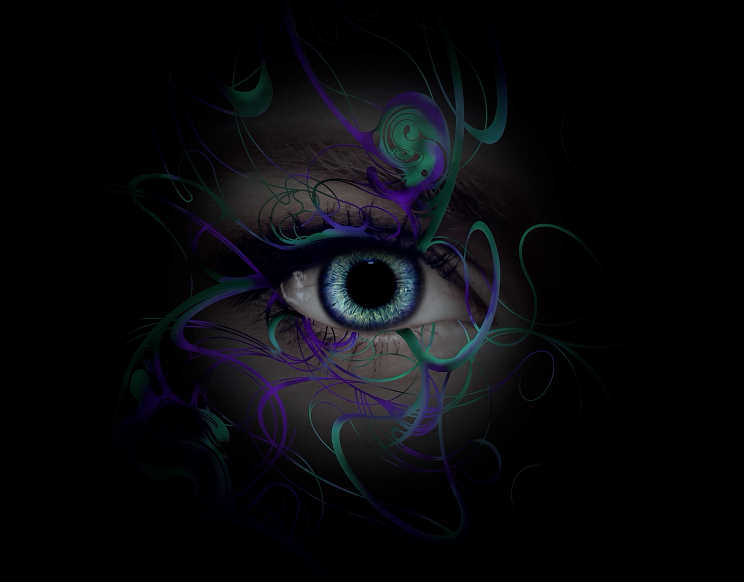
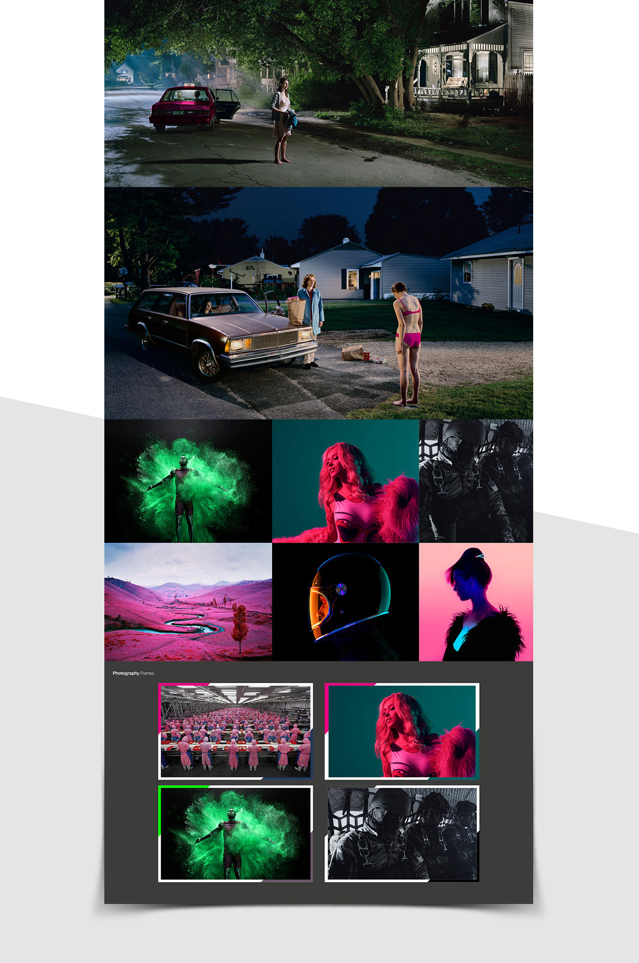
Photography
The idea with the use of photography was to always show a freeze frame moment in a wider story, To encourage the viewer to ask more and be inquisitive. The use of colour was important to highlight this and to give the brand it's own visual lexicon.
Print and Online
Print assets were made to mirror the film style and create impact. The website was designed to show how each of their clients can interact with the new mark and the branding and colour scheme can work with news items and a social feed.