REFRESHING A BELOVED ISLAND
The Brief
Thorpe Park required a complete overhaul of their Ecom Website as well as a simplification of their UX journey, it had been managed by many disparate owners and had become bulky and disjointed.
The Response
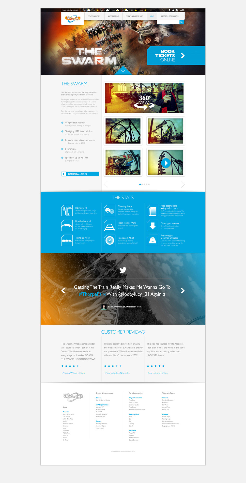
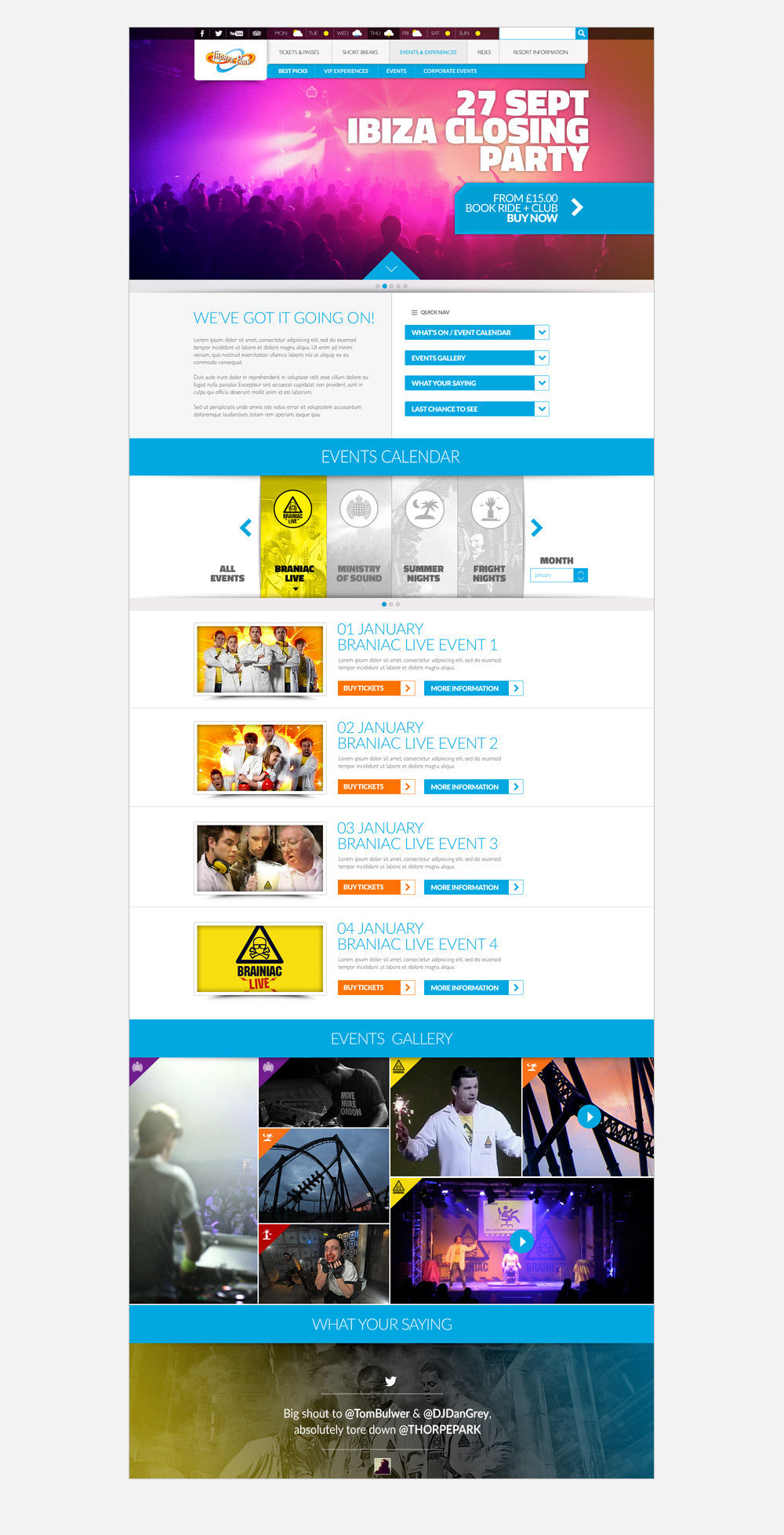
I began by simplifying the site from 15 sections into 5, working closely with the individual department stakeholders to make sure they were all represented. After working to create different user profiles I then created high fidelity interactive wireframes which fed into a clean responsive site design that not only got across the beloved locations fun factor but also had a much more streamlined UX designed to both increase sales for Thorpe Park as well as make the site much easier for the user.
Rides for the whole family
User interviews brought up the issue that different family members were often left disappointed after planning a visit to the park as there was no easy way to show ride heights for all the rides, as well as info like whether it was a wet ride, had fast track access or family friendly. I made a simple responsive filtering and icon system that quickly answered this.
A Simplified Ticket System
The number of ticket options was reduced from over 10 to just 3 with a focus on the best value option for both Thorpe Park and the user.
